Saturday 14 December 2013

Inspiration: Sarah Raphael's 'Childhood Cube'

Sarah Raphael's 'Childhood Cube' was in the creative gallery of the Museum of Childhood. Made in the millennium with input from primary school children, its filled with lots of little models and decorated with swirling patterns- to me, it was a playful, innocent, fun celebration of life through a child's eyes. 


Going with the idea of taking reference for my print work from hybrid imagery of my objects, this cube sculpture, with its randomly juxtaposed elements made by lots of different children and all pieced together, is another fun bit of visual inspiration. I like the crazy, patchwork feel it has due to all the separate parts being viewed at once, and I'll be experimenting with this feel in my digital prints. 

artwork reference:
Raphael, S (2000) Childhood Cube Mixed. Media sculpture/installation. London: Museum of Childhood

The Museum of Childhood

I had a great visit to the museum of childhood this week. 
When I walked in, the 'confiscation cabinets' display immediately reminded me of my Box Clever objects! Even the style of display echoes back to how my objects looked when I did my pop-up display in college at the start of the project- it made me laugh! Pocket sized, bright, plasticy and shiny, it's easy to see how such items might become distractions at school...
Display of items confiscated from children in primary school classrooms
at the Museum of Childhood
I was really fascinated by the little handwritten notes and folded, scrawled on bits of paper in the first cabinet. It brought back memories of how me and my friends used to pass secret, funny or sweet messages to each other under the table at school as well. When I  went back home, this idea inspired another paper cut stencil for my print block. I love the way kid's notes are a big jumble of words and phrases, with some bits crossed out and no worry of whether parts are upside-down or squished in. For my stencil, I cut out a jumble of words all relating to the objects in my box, and how they make me feel in this childish style. It'll be interesting to see the effect when layered up with other stencils and printed!
close up of scrawled note from Confiscation Cabinet (MoC)
my word-based stencil for screen printing next term
I also had good fun drawing from objects in the museum's main collection, where they have toys from across the ages. Things that really interested me were the constructive toys…linking to my box of things to physically 'play' around with, this type of toy is meant to be manipulated, taken apart and reassembled. There is a feeling of excitement and opportunity, as the toy has components that the person playing gets to decide how to put together. I also really liked the plastic character toys- robots, little people, ect- they have personality and a sense of humour due to their graphicy, humanised features that make them seem alive. 
montage of some of the objects I was drawn to in the museum collection
sketching at the museum

When I was making my paper collages last week, I used the word 'hybrid' to inspire how I put my imagery together. Looking closer at objects in the museum today however, I realised lots of toys are hybrids already, especially the construction based ones I like so much! Now I am thinking that for my photoshop (CAD) print work, it will be fun to try creating hybrids of my already hybrid-objects; taking parts of my drawings and photos and playing around with digitally collaging them together to create motifs and patterns. Lets see how it goes!


Making Stencils

I have always admired Louise Gray for her use of print. I mean, just for example, isn't this a wonderful look from SS13…
Louise Gray SS13
(accessed at http://www.style.com/fashionshows/review/S2013RTW-LGRAY/ December 2013)
I think it's her layered, more is more approach that really appeals to me. Prints are placed within prints, and I love the build up of all the patterns and colourways just on the individual garments, let alone when combined together into a whole outfit!

Today I started cutting stencils to be used for screen printing for my Print Technical Block which has now begun. Keeping the layered style that I love so much in Louise Gray's work in mind, my aim is to create many stencilled shapes to then overlap and hopefully print in lots of fun and exciting ways! I enjoyed having some wall space to pin up my drawings in the studio- I was surrounded by my rather crazy inspiration!
my space!


External Image reference: 
(2013) Louise Gray SS13 Print [Online Image] Available at http://www.style.com/fashionshows/review/S2013RTW-LGRAY/  [Accessed 12/13]

Inspiration: Eatock's playful pen prints

I've been using markers a lot recently in my research drawings- the bold, graphic marks work well for extracting ideas from my box of playful things. But look at these! I can't help loving how Daniel Eatock has played around with the markers in a slightly different way, using them to create sets of 'prints'  from. 

Created by simply placing paper ontop of upright marker pens, and allowing the ink to organically soak into the paper, the results are bright, colourful and unpredictable…I like the fact that it is impossible to create the same thing twice. I like the slightly random, out of control way the prints form. 
Especially inspiring to broaden my view of 'print' at the start of my print technical block!

Image Reference:
Daniel Eatock (2011) Pen Prints [Online Image] Available at http://eatock.com/projects/pen-prints/ [Accessed 30/11/13]

Tuesday 3 December 2013

Hands on Drawing

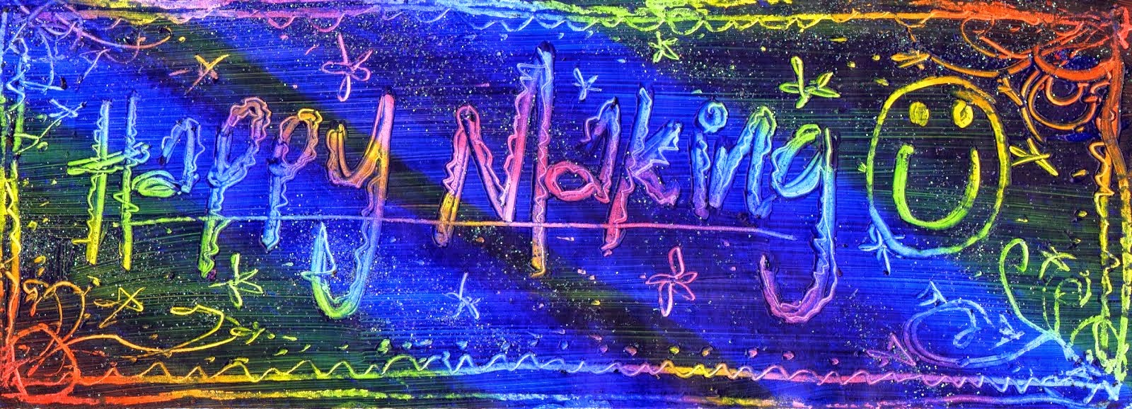
The 'drawing week' just gone wasn't made up of sitting around quietly sketching- oh no, it was the complete opposite: collaborative, large-scale and hands on! I felt like I was in one of those Art-Attack challenges that I used to love watching on kids TV.

For our first task, we were each given a 1cm section of a cut-up picture. Without being told what the image was, we then had to enlarge and draw out our section onto an A1 sheet. It was actually quite freeing not having a clue what I was drawing, or how it fitted in with the rest of the picture as a whole. Seeing everyone's different drawing styles in our group, it was interesting to imagine how our drawings would fit together as one. When our individual sheets were all taped together in sequence, then dramatically unveiled from the balcony at the end of the day at college, it was quite a surprise…we'd drawn the Queen! I think she turned out looking quite fine...
my tiny section to enlarge- I had no idea at the time it was part of the Queen's crown!
Taping and rolling the drawing together face down: still in suspense- what was it?
The unveiling- it's the Queen!

Continuing with a royal theme, the next day we were instructed to create a portrait of Henry the 8th from Lidl plastic bags. This specific (and perhaps slightly random!) constraint on our media use, lead to quite an amusing result. I like experimental processes, and it was good to be reminded how just following through an idea to see the results, can allow you to play around and have fun- the constraints we were given stopped us having to make choices about what we were doing, freeing us up to just get creative with the materials at hand. 
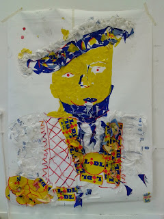
Bags, scissors and glue. A truly regal King Henry-sponsered by Lidl?!
We also used the bags as a way of exploring colour, creating gradients and mixing colours using just shades of red, yellow and blue. I love working in the studio and getting to tape all our work on the walls as we go. Just seeing all that colour is instantly inspiring!
I tried to keep my creative process loose, fun and free in our collaging workshop the next day, where I was working from my Box Clever project objects again. 


Finally, a bit of life drawing. I decided to join the UAL life drawing society after getting to do a few sessions on foundation, and finding it really useful and challenging. Hopefully this will give me a chance to to practise, and improve my drawing skills and style. here's a few from when I went the other evening. It really has been a full on week of drawing!