Showing posts with label colour. Show all posts
Wednesday, 1 April 2015
colour development
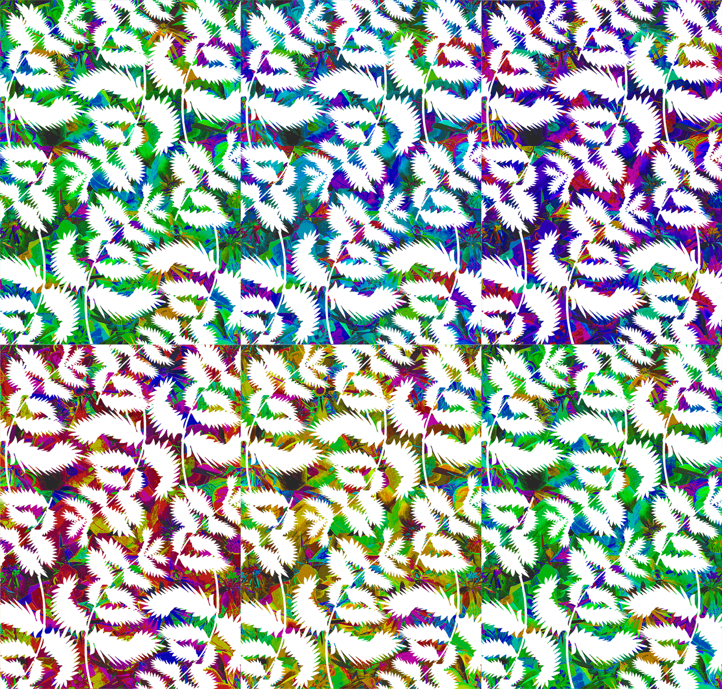
from beginning to making-- parts of the colour development process for my 'weka rangi' jewellery collection
Thursday, 23 October 2014
extracting colour
After the colour workshop, I've been going through my research photos and pulling out the colours to make some more palette arrangements linking to my project.
Seeing as the Tanzanian landscape had quite a busy feel, with many different materials and surfaces being recycled and reclaimed, and being reused in a multitude of ways, I like the idea of using found objects in my colour work...it's like the 'fabric' of the environment there was very responsive, in flux, and cultivated collectively by all the people living there...so I want my work to have a similar feel...a bit of a jumble...collections and arrangements of colour that evoke the lively, quirkiness of the place....a sense of rawness and imperfect human touch....a realness and an immediacy....
colour play
Last week we had a fun workshop with Phillipa Wagner, all about exploring colour. I found her theory on 'natural palettes' (the idea that we all have colours we are comfortable working with, and naturally gravitate towards) really interesting- and quite a useful thing to consciously understand, as a designer! Plus, it was a great way to get excited about the idea of arranging colours, considering our current project brief.
We were instructed to grab 6-8 objects the bring along to the workshop, and then worked in groups of 3 to arrange our collective chosen objects into a 'colour matrix'. It's useful to see colour spread in this way, in order to recognise the balance of the colour you're working with. Funnily enough, in our group, the colour range was perfectly proportioned- Heather had bought all neutral, natural coloured objects, Lisa's were all light and white coloured, and my objects were all bright colours! So our matrix covered all the bases:
Then we composed a set of different colour palettes using our collection of colours from the matrix. I loved doing this as a group - we took it in turns to each add a colour to the palette, discussing how it would change the overall effect in combination with the other colours that were being added. It was fascinating to share our different approaches to colour as a group!
Here were our palettes. First up we made a mini collection of the objects we wanted to dicate the colours for each palette...then, we searched for fabric swatches to translate the palette into a textile story:
set of objects, then swatches for our second palette:
3rd collection/palette:
Our final group palette. For this one, Philippa challenged us to work with a gradiating move of colour across the palette, as all our previous combinations had a good spread of lights/brights/darks. So here, we went for a neutral flow:
This has definitely made me think about my own attitude to colour...and how my own attraction to brights generally seems to channel it's way into my design work, somehow or other!
Finally we made up our natural palettes derived from the objects/colours we'd intuitively selected for the workshops as individuals. Here's mine:
And actually, these colours are similar/connected to my project colours right now- the orange, plummy pinks/raspberry, and the bright green. What a co-incidence....!
Now it'll be fun to carry this experimental palette creating approach through to my work. I also like the idea of using objects to original represent/derive colour from. This could be carried further through the design process, and the objects could perhaps feature in the designs somehow themselves? Let's see- it's all to play around with!
Monday, 19 May 2014
Gifs for 'Stop & Bloom' project
I wish I'd blogged my processes all through this current project- I've had so many ideas and references and directions to look into, it would have been great to have an accessible record of all that here. I'll just have to make this my aim for next year's projects!
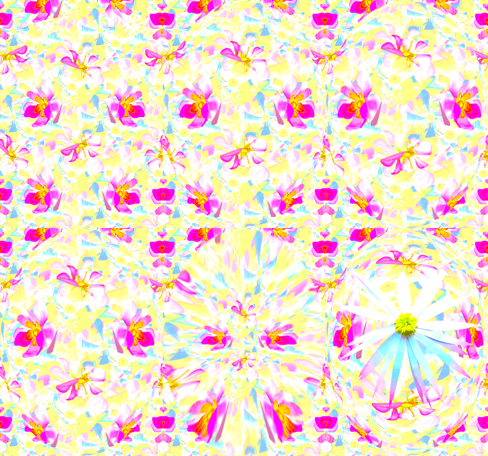
But for now, I thought I'd upload the gifs I created as part of my idea development and exploration for my unit 3 interiors/exteriors/spatial brief. I wanted to play with colours and a sense of movement in the patterns I was creating, and the gif format was a fun way to do so. My project is all about bringing colour/imagination/fantasy through floral imagery to the urban environment of the bus stop on my road. For my final outcome I constructed lots of paper flowers, and made them into an installation for the community at the bus stop. I created digital patterns from my photography of these paper flowers, and then used the prints to visualise a pattern render onto the bus shelter as well. 'Stop & Bloom' seems like a good name for my project.... I let my imagination run wild with the simple floral imagery of the flowers I found in the bus stop garden, and tried to create outcomes that would really make people STOP at the bus stop, and smile at the 'blooming' (!) floral installations around them.
So, here are the developmental gifs that I created along the way:
But for now, I thought I'd upload the gifs I created as part of my idea development and exploration for my unit 3 interiors/exteriors/spatial brief. I wanted to play with colours and a sense of movement in the patterns I was creating, and the gif format was a fun way to do so. My project is all about bringing colour/imagination/fantasy through floral imagery to the urban environment of the bus stop on my road. For my final outcome I constructed lots of paper flowers, and made them into an installation for the community at the bus stop. I created digital patterns from my photography of these paper flowers, and then used the prints to visualise a pattern render onto the bus shelter as well. 'Stop & Bloom' seems like a good name for my project.... I let my imagination run wild with the simple floral imagery of the flowers I found in the bus stop garden, and tried to create outcomes that would really make people STOP at the bus stop, and smile at the 'blooming' (!) floral installations around them.
So, here are the developmental gifs that I created along the way:
Saturday, 14 December 2013
Inspiration: Eatock's playful pen prints
I've been using markers a lot recently in my research drawings- the bold, graphic marks work well for extracting ideas from my box of playful things. But look at these! I can't help loving how Daniel Eatock has played around with the markers in a slightly different way, using them to create sets of 'prints' from.
Image Reference:
Daniel Eatock (2011) Pen Prints [Online Image] Available at http://eatock.com/projects/pen-prints/ [Accessed 30/11/13]
Created by simply placing paper ontop of upright marker pens, and allowing the ink to organically soak into the paper, the results are bright, colourful and unpredictable…I like the fact that it is impossible to create the same thing twice. I like the slightly random, out of control way the prints form.
Especially inspiring to broaden my view of 'print' at the start of my print technical block!
Daniel Eatock (2011) Pen Prints [Online Image] Available at http://eatock.com/projects/pen-prints/ [Accessed 30/11/13]
Subscribe to:
Posts (Atom)